1

Sprucing up the Front Porch

Here is another project that started out simply, and then took on a life of its own. With all this time at home, I am noticing there are so many areas that need sprucing up. This includes the front porch.

It all begins with the rocking chairs.

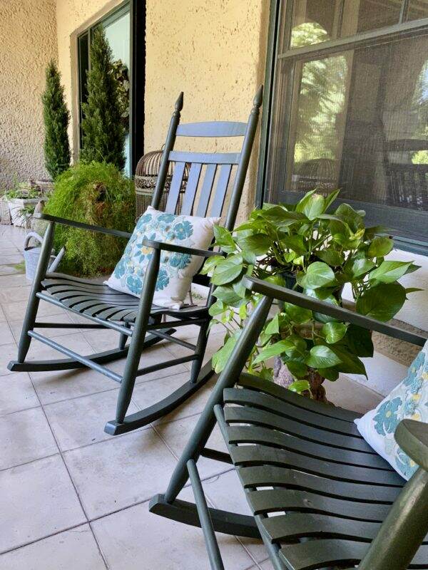
The four rocking chairs on the front porch did require new paint. This is a fairly easy DIY that can be done in a day. Lately I feel dangerous with a can of paint and a paintbrush! Don’t stand still too long or I will paint you!

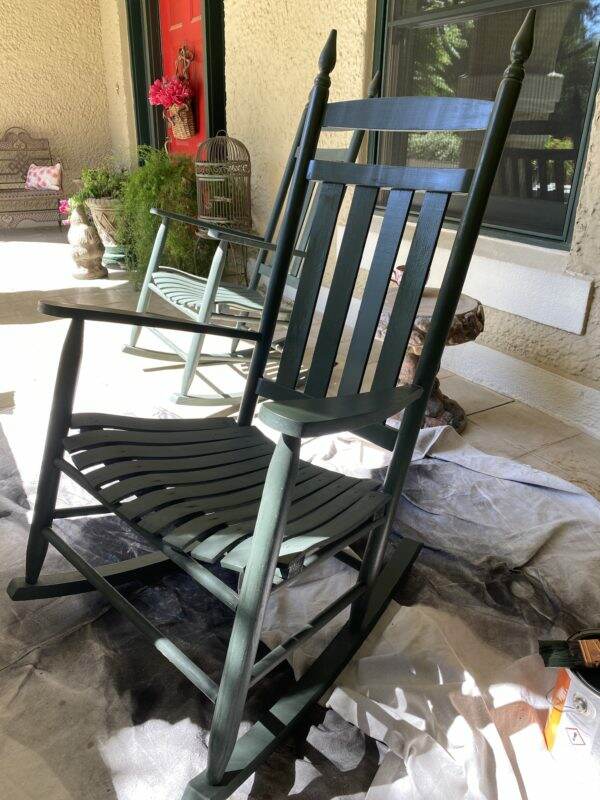
What a difference one coat of paint makes!

With the chairs looking so new and pretty, the rest of the porch paled in comparison. Remember the blog post on Selecting a Front Door Color? If you missed this post, click here.

Now the Front Door

Thanks to all of your great suggestions, the new paint color samples were purchased.

Picking a paint color online is a different experience than going to the paint store. Since curbside pick-up is the only option available at this time, I was a bit surprised when I opened the cans. For example, the Feverish Pink is a deep berry color online and the Gladiola is a spicy, rich dark paprika color. Look how different the tones are in real life! Much brighter than I expected.

The two blue paints are much lighter, too. However, after applying the samples, I was leaning toward the blues vs. the reds.

The pillow from Pottery Barn becomes my inspiration, because it is a combination of the dark greens and the cool blue. Not thrilled with the samples from Sherwin Williams, I dug out a can of the blue paint used in our library. That didn’t float my boat, either.

Referring now to a color palette, Drizzle is a bit darker with more green/gray overtones. I am convinced this is THE color and I take the leap and paint the entire door.

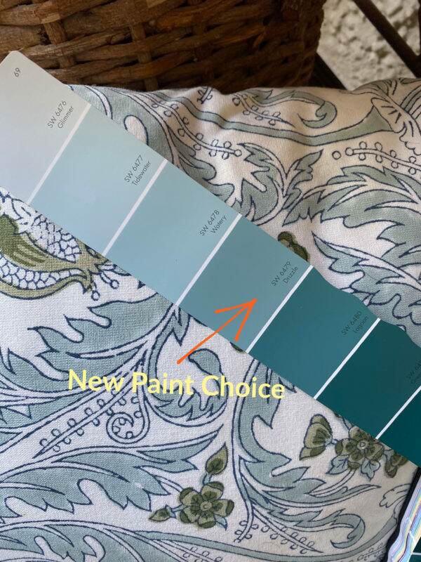
I am disappointed that the chip and the paint do not match. But I leave it hoping that the paint will darken as it dries.

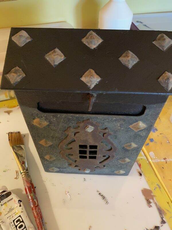
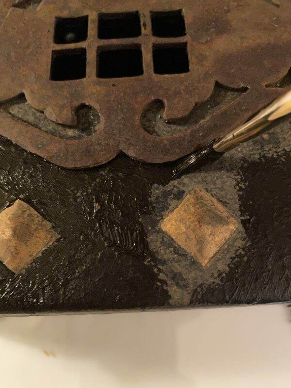
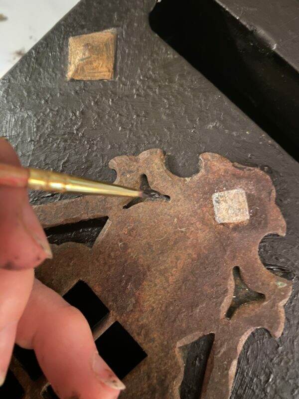
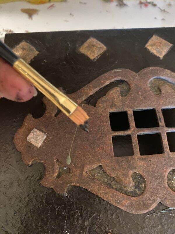
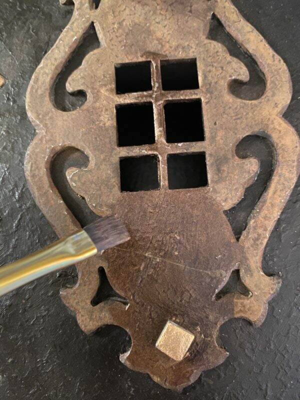
Cleaning the Hardware

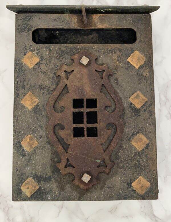
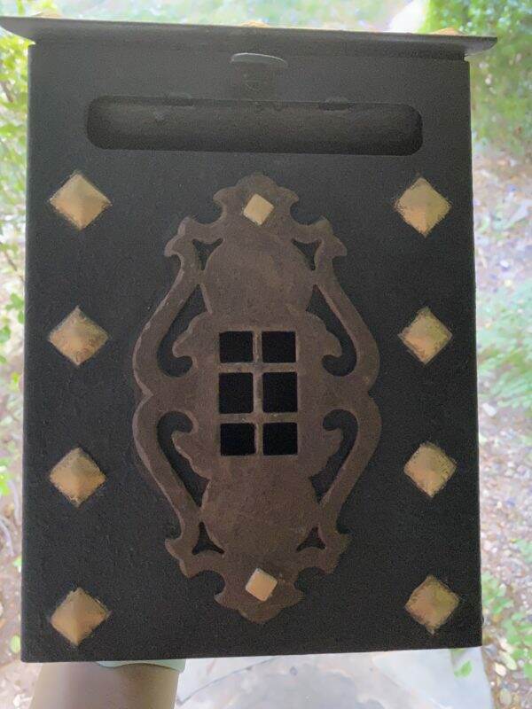
Meanwhile, it is the perfect opportunity to clean up the door hardware. The brass door latch is assumed to be original to the house. With a bit of elbow grease and brass polish it went from dull to dazzling.

Selecting New Plants~both real and faux

Keeping plants alive during the summer months is always a challenge in Phoenix. Since they are not on an automatic drip system, they require hand watering. As a result, the foliage around the front door suffers.

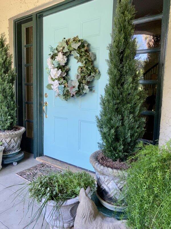
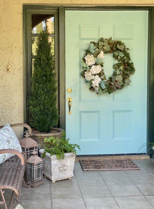
Instead of live plants, why not some artificial ones? I was able to locate these 5 foot tall cedar trees online through Amazon. I placed them inside the existing stone planter and will not need to water them ever.

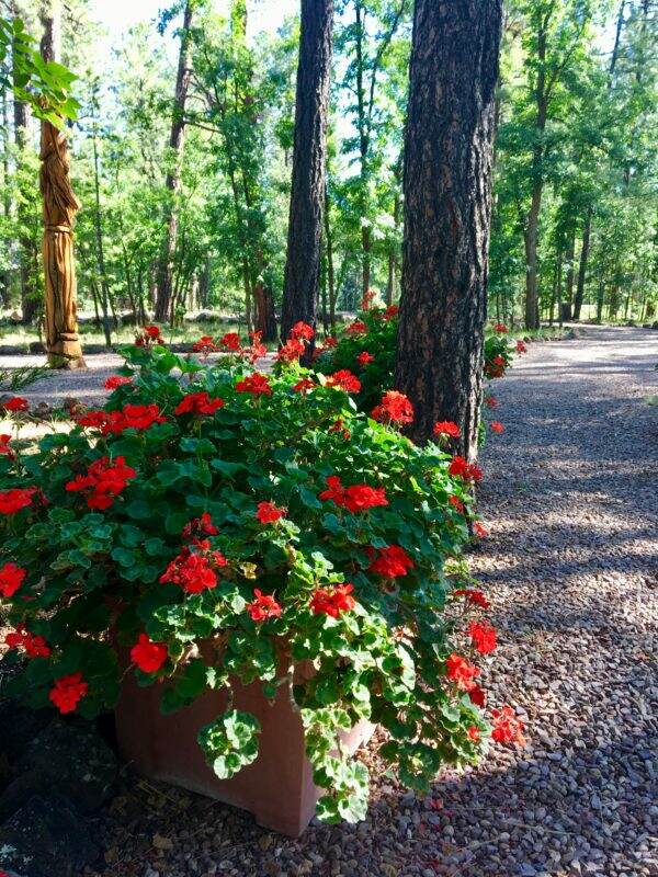
After a recent visit to Whitfill Nursery, the addition of vinca and rose-scented geraniums will round out the foliage at the front door, and hopefully survive the summer heat. The asparagus vine does exceedingly well here.

Accessorizing

I love these old stone tables~~they are very heavy and ideal for the outdoor climate.
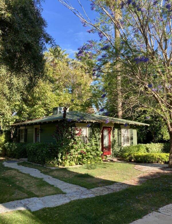
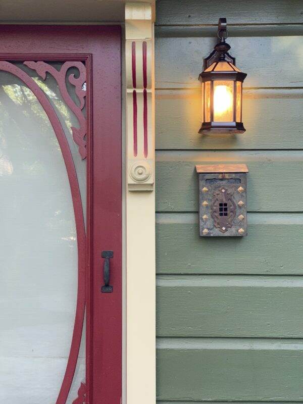
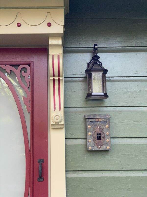
The finished porch

So here is the nearly finished spruced up front porch. The door color is growing on me, and my daughters love it. I’ve decided throughout this process that I am a conservative color person. Not sure why I am hesitant about throwing caution to the color wind, but I do wish I was more bold.

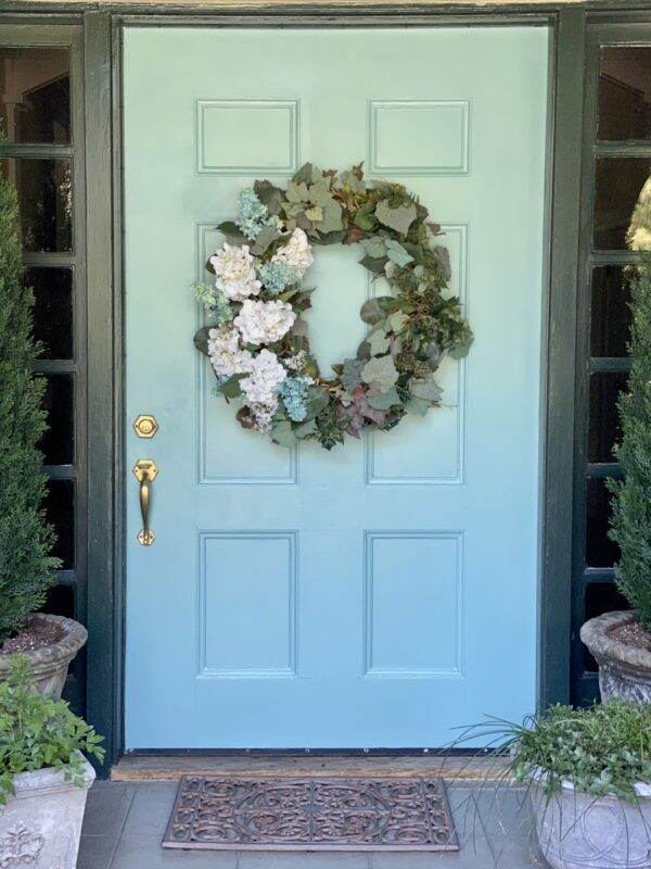
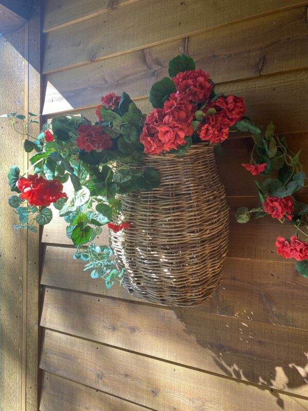
The wreath is re-designed to complement the door. Being a Connecticut Yankee, I love to repurpose items vs. buying new. To read an old post about re-working this wreath, click here.

The door/wreath before…

and After……

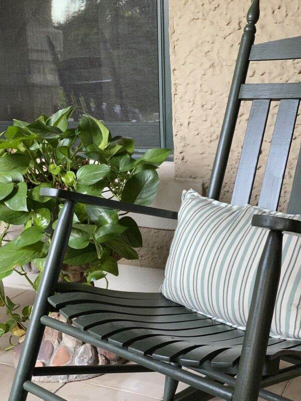
I am experimenting with different pillows on the chairs to see which ones look best.

Thank you to my friend, Joann, who told me to “STOP DEBATING. BLUE all the way”. I sometimes noodle these decisions over and over in my head, which is maddening. Though the door color feels a bit out of my comfort zone, I am leaving it up. Even my friend Anne, who loves bold colors, said it is growing on her.

The week seems to be flying by. Are you in the middle of any projects? Hard to believe it is already Wednesday. Have a wonderful one!


Project Dilemma Solved!

I can’t tell you how much I APPRECIATE all the great comments regarding the vintage mailbox dilemma. If you missed yesterday’s post discussing the sad looking mailbox, click here. If you are visiting via HomeTalk, here is the post about the exterior light project that started the conversation about the mailbox re-do. As you can see below, freshly painted exterior light fixture makes existing mailbox stick out like a sore thumb.

I combined all of your wonderful thoughts and decided to do this to the mailbox. I spray painted the inside, sides and back the same color as the guest house light fixture~~an oil rubbed bronze, which is quite dark. Since there was some rust, the Rust-oleum paint will hopefully slow down any further deterioration.

In spraying the sides, I was careful not to get any of the overspray on the front or top.

After allowing these sections to dry, it was time for hand painting the front and top of the box. The metal isn’t smooth, but not hammered either. In this next photo, you can see the difference between the painted and unpainted surfaces.

Using spray paint on the front isn’t an option. Since the oil rubbed bronze spray paint is very dark in hue, I hand mixed the paint to use on the front. I combined Mars Black and Burnt Umber to create a warmer black. Sorry for the shadowy photos as I took these photos at night.

Hand painting the top of the mailbox allowed me to see how the new paint would look before I attempted the more visible face of the box.

Here is the top prior to painting the diamonds.

At this point, I really like the fresh paint and so I take a deep breath and continue onto the front! Using 3 different size brushes, I make my way around the diamonds and the curlicue.

I decide to sand the curlicue because I want to remove that drip of old pale green paint which I failed to notice beforehand. I wait for the black paint to dry first. Thankfully, I am able to get most of the paint drip off.

With so many leftover craft items, I have two tubes of gold and bronze Rub ‘n Buff metallic finish for the diamonds and curlicue. Though the instructions say to rub it on, I elect to use a small paintbrush.

Yes, Rub ‘n Buff can be used on metal. And it dries quickly! To see another project where I used this product, click here.

At this point, I’m not sure if the Antique Gold is too bright but I paint all the diamonds. I take the time to touch up with the black/umber paint where I get sloppy.

The Spanish Copper Rub ‘n Buff tube is a bit solidified and the contents will not easily come out. However, a bronzy liquid squirts out instead, and I use it anyway on top of the gold to tone it down.

I also paint this bronzy liquid on the curlicue to cover any scratches and dings. I paint the two rivets gold.

So here is the before…..

The mailbox after…..

Unfortunately the sun is shining directly on the front this morning, so the light in the after photos is not the same.

The light and mailbox before….

The light and mailbox after……

The mailbox still has its vintage charm, but the new paint makes such a positive difference.

Thank you to Karen, Barbara (from Mantel and Table) Janie, Linda, Marty, Karin, and Louise for your helpful comments. They truly gave me the inspiration to take the leap and paint this mailbox! I may have to spray it with a protective clear coat as I am not sure how my acrylic paints will hold up over time.

Marty, a subscriber, asked to see a bigger picture of the guest cottage. Again these were taken this morning with the eastern light exposure.

The hollyhocks have taken over the corner garden and the jacaranda tree is in full bloom.

It is such a beautiful morning here. The temperatures are in the low 70s and my morning walkabout was so joyful on this glorious Wednesday!

Enjoy your day! Please remember you can follow me on Instagram @lifeatbellaterra or Facebook. To see more pictures of the guest cottage, click here. Thank you for joining me today from HomeTalk and if you like what you see, I would love for you subscribe to Life at Bella Terra.

Products Used:

Rustoleum Oil Rubbed Bronze spray paint

Rub ‘n Buff Wax Metallic Finish-Spanish Copper and Antique Gold

Golden acrylic paints-Mars Black and Burnt Umber


Project Dilemma

The exterior lights to the guest cottage were looking tired and faded. What started as an easy DIY project now has me stumped about another. It seems like every time I start one project, it inevitably leads to ones I haven’t considered.

As you can see below, the exterior light fixtures to the guest house look like this. The original oil rubbed bronze finished has oxidized and faded over time.

Side entrance

I do like the classic shape of the lantern, which fits the quaint exterior of the guest cottage. Often I like the design of a light, but don’t like the finish. If you find a light you like, it is easy to change the appearance with paint.

After carefully removing the light (please make sure the power is OFF or have a licensed electrician do this), I cleaned it thoroughly. I did this by using water and a paper towel. Since the glass panels did not slide out, I carefully taped all the places that I wanted paint-free.

This is the most tedious part of the preparation, but it is better to prepare and prevent rather than repair and repent. I wasn’t quite sure of the color I wanted, so I painted them a Rust-oleum brown first and then lightly used an oil rubbed bronze spray over the brown.

After removing all the blue painters tape, the lights look brand new. I am please with the clean and fresh look.

Now the entrance looks a bit more perky.

I posted this project on HomeTalk and so far it has had nearly 10,000 views. To read the more detailed DIY on painting lighting fixtures, click here. However, one HomeTalk comment was “the lights look so good, is the mailbox next?”

Quite honestly, I never even noticed how sad the mailbox looks. It is a vintage box and I’ve haven’t seen another like it. But, the metal mailbox does look like the ugly sibling now. What should I do with it?

The gold-ish diamonds are also on the top of the box and a bit raised from the surface.

I like the design of the box because the front opens forward for you to reach your mail.

So what should I do to the mailbox? Leave it alone? Re-paint the black or another color? Paint the whole thing? Just give it a clear coat? If so, shiny or satin? I cannot remove the curlicue piece on the front as the rivets are welded in.

This mailbox does need a face lift! Please send me your thoughts as I’d love to wrap up this project this week. Since I received so many good ideas on my front door color request, I am hoping I can tap into your expertise on this one!

Have a wonderful Tuesday! To see more on this sweet guest cottage, click here.


Escaping to the Cabin

After a very stressful week meeting unpleasant deadlines, I jumped at the chance to join my husband in his annual “take the geraniums to the mountain” trip. The high temperatures in Phoenix are distressing the many potted geraniums we have. Each spring we pile them in the back of the pickup and drive them to moderate temperatures for the summer.

We arrived late last night to a cool and windy 65 degrees. This morning, the skies are clear and blue and sunny.

Since we haven’t been here since November today will be cobweb cleaning and opening up all the windows. One of the first things I check is the basket of geraniums hanging outside the front door. A few years back, a momma bird built a nest and has been returning each spring.

Here is a picture of the nest this morning. No eggs, but the photo with eggs was taken at the end of May 2019.

Though it will be a day of chores, there is something cathartic about letting in the fresh air and getting rid of the dust and winter staleness. We will unveil Gandalf, our carved pine tree. The tree died a few years ago and a talented wood carver created our one of a kind yard art piece.

The pear and apple trees have blooms on them~a good sign that we will have fruit again this year. I still find it so strange that we didn’t even know we had a pear tree until last year, as it did not bear fruit for the last 7 years.

As I wrap up the last of my coffee, I hope my stress less vibes reach all of you today! Have a glorious weekend and happy May! If you would like to see more pictures of our cabin, please click here.


An Abundance of Flowers

First of all, thank you for all the wonderful front door color suggestions and comments! It is so enjoyable to hear your thoughts on yesterday’s blog post. I am so excited to start experimenting with different colors. More to come.

I find it so interesting that some areas of the country are still experiencing snow, where we are having our first taste of summer. This last week the temperatures have been over 100 degrees and I’m just not ready for the summer heat.

Summer, for most areas of the country, means bountiful gardens and outdoor entertaining. Here in Phoenix, it is the opposite. My garden, for the most part, goes fallow. The intense sun burns the plants (unless you have big, broad leaves for protection). And you cannot do anything outdoors in the Valley of the Sun unless it is early in the morning or late at night. The heat can be dangerous and the thought of laying out in the sun equals skin damage.

Typically the summer is also our monsoon season~sometimes with rain and other times not. Dust storms blow through and cover the land with a layer of dullness. So I am trying to cherish the last bits of our Spring, where the gardens and flowers are bountiful.

Since it’s been a bit of a stressful week for me, today’s blog post is all about beautiful pictures~~the Spring we dream of during the last, long sweltering days of summer.

These photos were taken with my iPhone, during my walkabout yesterday morning. No editing done. One of the positives about spending so much time at home, is I find myself really “looking” at things. In the past, I took these flowers for granted. But now I find wonder in focusing in on each and every one of them. Look at the depth of beauty in the purple pansy or the pale yellow orchid!

I cannot express how grateful I am to have a yard to enjoy. A place to walk barefoot in the grass. A respite from the world’s nastiness. Where I have so many fond memories of my children’s escapades.

With each week, another flower blooms as one dies. My beautiful bulb garden, which provides such joy and color, is now gone. But the roses are at their peak so I don’t mourn the loss of the tulips and iris.

In addition to the flowers, the trees in the orchard are heavy with fruit. Soon we will have peaches and apricots and apples. I still think it is VERY strange to be picking apples in June vs. the romantic notion of doing so on a crisp fall day.

Clematis arch leading to guest cottage

During a tumultuous time, I need to seek a way to ground myself. I’ve decided, just by writing this post, that my two words for today are: Grace and gratitude. So grateful that we can connect via this blog and so grateful for you taking the time to write a comment. Your words of support and encouragement are priceless. Grace may take a little more effort for me!!! But like many things in life, it’s a work in progress.

Have a glorious Wednesday! What are your word(s) for today?


Selecting a Front Door Color

It appears I’m in a bit of a painting frenzy. Not the artwork kind of painting, but the “what needs painting next” kind of painting. Paint is one of those home improvement items that is rather affordable, easy to use and makes a significant impact.

Since the front porch is looking a bit tired, I am pondering ways to make some affordable improvements. I do believe it is time to re-think the color of the front door. Red seems appropriate as it is the complement to the dark green house trim. But it is time for something different.

Selecting Colors with Web Technology

Sherwin Williams has a color technology section on their website which allows you to “paint” different colors into your own photo. I uploaded a picture of the front door and began experimenting with different colors. How cool is this! It is ColorSnap Visualizer for the web and you can do an interior room or the exterior of your home.

With an icon, you “paint” the area you are interested in. You can choose up to 8 colors from the color charts on their website and create “My Color Palette”.

At the bar on the bottom of the screen, you can see the colors I selected to try~~black, dark green (like the trim), cayenne, sage, and two shades of blue.

I have always loved a high gloss black door with beautiful brass hardware. You see many of these in London. However, when I tried it on this software, the front door almost looks like a big black hole. And would the black be too dark against the green?

What if I were to paint the door the same as the trim color?

Sage green almost always looks so beautiful on doors, but not so sure on mine. Sorry for the blurry photo as I was taking pictures of my computer screen with my phone.

Several years ago I did have a French Blue door. I loved it! I was into all things French back then. Not sure I want to repeat it?

Here is the ColorSnap Visualizer with a few different shades of blue.

What if I just need a different color red?

Since our home is historical, I am pre-disposed to doing a color that will be appropriate for the age. Or do I? Should I consider a stain?

My confidence level is fairly low on selecting colors, so I would appreciate ANY feedback on this. I know many of your have a great eye for these things.

Our local Sherwin Williams has curbside pick up during the quarantine so I may start painting a few color patches and see what happens.

Have a beautiful Tuesday!