1

Fall Decor Touches in the Living Room

It is that time of year when the temperatures are shifting ever so slightly lower, that I am inspired to add a few fall decor touches to the living room. I recently went to Trader Joe’s to buy pumpkins for my living room mantle and they had NONE. They had not shipped yet from the warehouse and no pumpkins were to be had in Phoenix.

As a result, I will show you the living room fall decorations sans fireplace mantle. Hopefully that will happen in the next week or so. The challenges of living in the hot southwest!

The living room colors are mostly linen white and French blues accents, with a richly color Oriental rug. Orange is a complement to blue so I sprinkled in some, along with white and neutrals.

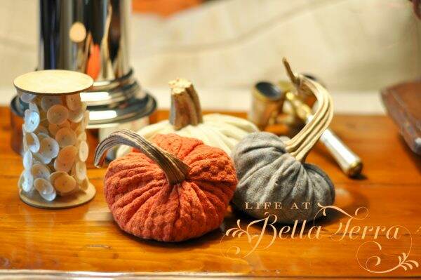
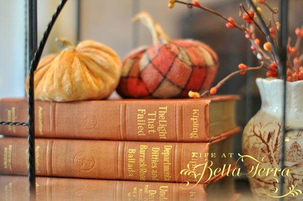
Thankfully I have a rather large selection of fabric pumpkins, and placed a few on the sofa table.

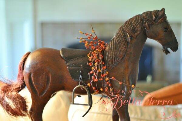
The horse sitting on the table behind the sofa did need something for this time of year, so a sprig of artificial berries did the trick.

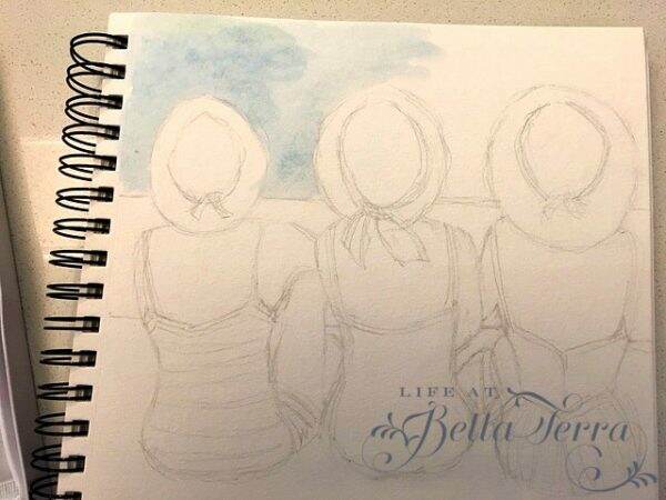
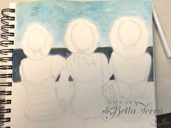
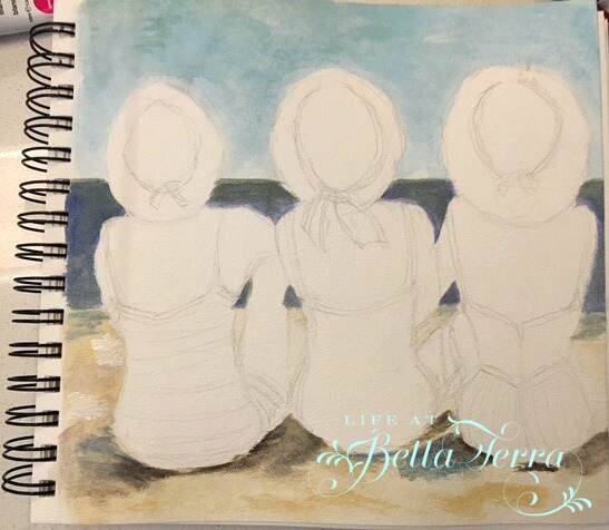
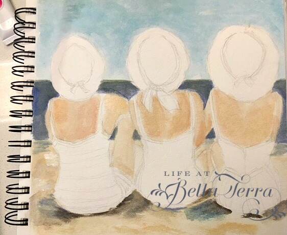
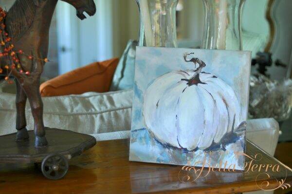
My pumpkin painting has the appropriate colors for this room.  Completed a few years ago, it was one of my first autumn paintings.

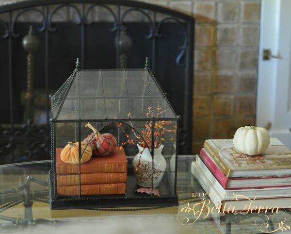
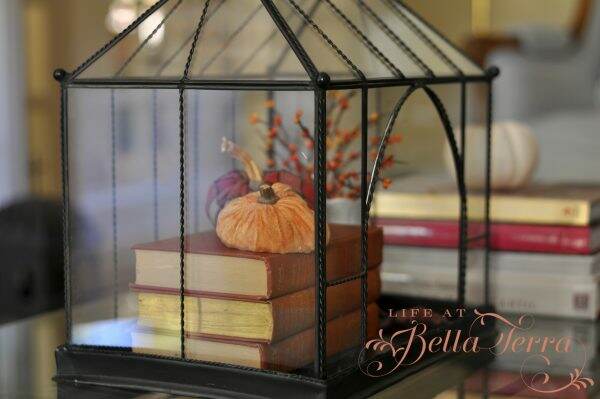
The coffee table’s English terrarium received a fall theme~~adding books, fabric pumpkins and some berries.

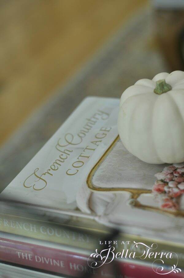
A blogger I follow, Courtney Allison from French Country Cottage, just released her first book. It is truly spectacular! I am getting ready to attend a book signing by Courtney~~cannot wait to meet her in person!

Perhaps the oldest piece of furniture I own, is a Hepplewhite Secretary, dating from 1790-1800. The glass doors are designed with 13 panels for the original 13 colonies. The lower portion opens up into a desk with beautiful inlaid wood cubbies. I purchased this many moons ago when I could barely afford anything. But I knew this was a special piece and have cherished it for decades.

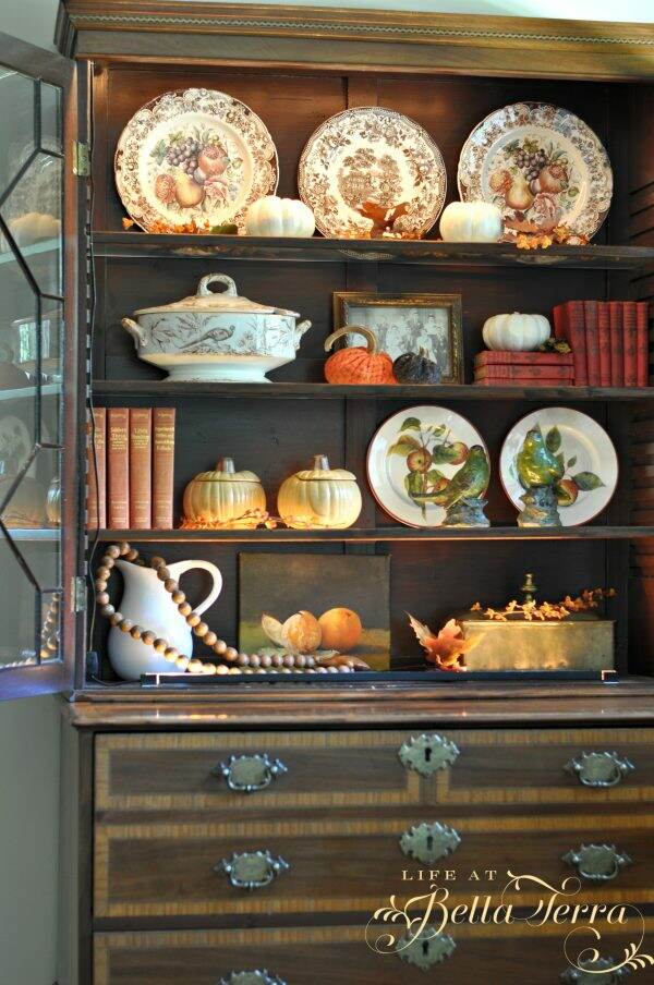
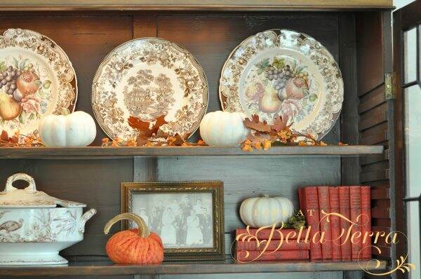
The shelves are glass and edged in wood. There is a strip of lighting both on the inside top and bottom of the shelves. If you look closely you can see the electrical wire on the right hand side. The light illuminates through the shelves and creates a warm, magical glow.

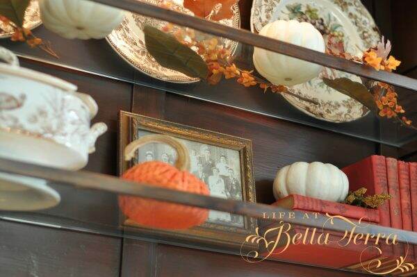
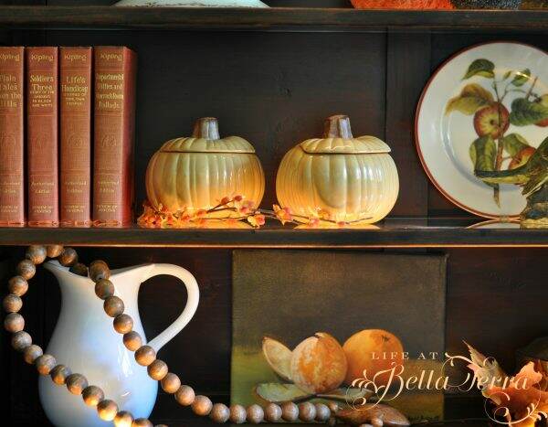
A few pieces of my English autumn china grace the top shelf.  Windsor Ware Harvest Fruit by Johnson Brothers has the fruit center and Tonquin by Royal Staffordshire is the other. I would love to keep adding to this collection so if you see any in your travels, keep me in mind!

Here is the view with the lights on.

The soup tureen is Indus RSR, an English brown transferware pattern from the 1870s.  It’s missing the ladle but I love the pheasant pattern.

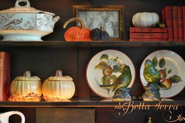
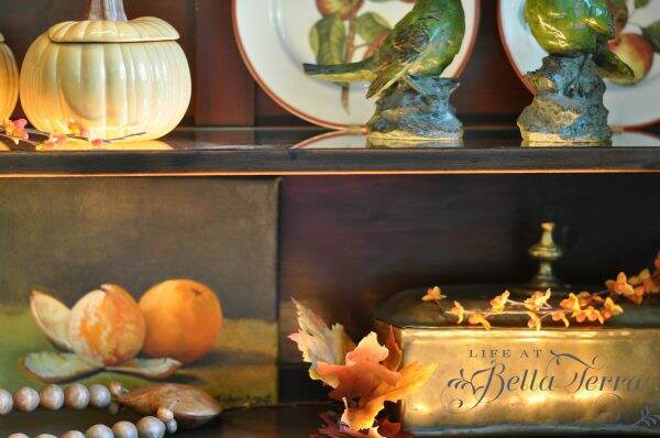
The pumpkin soup tureens and apple plates are from Williams Sonoma.

The wooden beads with a heart I purchased from Painted Fox.  I have no recollection where I got the birds, white pitcher or brass box.  The painting was a gift from my friend and art teacher, JoAnn Augur. To see another post about my art classes, click here.

With a hint of cooler temperatures in the morning, I am getting more inspired to add fall touches to the rest of the house.  Can’t wait to share them with you! To see some fall decor from last year, click here.


Paris Letters

I find it intriguing the way some people creatively make a living.  Imagine having an unfulfilling job only to leave it (after careful planning) and going to Paris? That is exactly what Janice MacLeod did and as a result, she wrote her first book and memoir, Paris Letters.

This is a book you continue to ponder long after the last page is read. Without giving too much of the story away, the author decides to change the course of her life.  In doing so, many unexpected gifts occur along the way.

Her journey leads the author to establishing her own business~~creating and writing “Paris Letters”~~yes, the snail mail kind.  You can sign up to receive your very own Paris letter from the author~~either just one letter or a 6 to 12 month subscription.

In the day and age of social media and the internet, it is such a gift to receive a letter in the mail. Excitedly, I signed up to receive a year of Janice MacLeod’s monthly Paris letters.  This can be done through Paris Letters Press on Etsy here.

If I didn’t read this book, I would have never known that a monthly subscription like this even existed!

I must admit I was waiting for the mail to come every day since I signed up…..and my painted letter arrived yesterday!

The envelope felt very Parisian, with lovely stamps.

Of course, how can one read a letter from Paris without having some French wine? It’s been so hot in Phoenix that only a very chilled bottle of rosé will do. Not the sweet one, but the dry version from Provence.

Isn’t this just beautiful?

Janice does the illustration in watercolor that accompanies the letter.

Wouldn’t this be a lovely gift for a relative or friend? If you know of someone who would appreciate getting a beautifully illustrated letter in the mail, this is perfect!

Since I enjoyed her first book so much, I just completed her second book, A Paris Year.

Unfortunately I read it on my Kindle while on vacation, therefore didn’t get to appreciate all the color pictures and illustrations in the book. If I were ever to go to Paris, I would bring this book as my guide.  Janice goes through each day of the year detailing the sights, activities, and the nuances of Paris.

I received 3 things from this experience.  1) Found great books to read and lessons to contemplate; 2) Discovered Paris Letters and subscribed; 3) In my own way, I am helping a small, creative, business owner.

Happy Tuesday!


Gouache Paints

Reeves Gouache paint kit

My dear friend, Susan, gave me a gift of gouache paints for my birthday.  I had no idea what gouache paints are and am a bit reluctant to use them. However, I did bring the paints with me on vacation, thinking it is a wonderful time to try something new.

Supplies you will need

This gouache kit contains 24 artist colors and can be found here. In addition, Susan also provides me with an airtight paint palette (here) and aqua-flo brushes (here). For a minimal investment, you can start painting with gouache too!

And I can always use a watercolor paper journal! This one is 8″ x 8″ and can be found here.

What are Gouache paints?

Gouache paints are more opaque than watercolor.  The opacity of gouache comes from the white pigment or chalk that is added along with the colored pigment and binder in order to make it less transparent. So like watercolor, you add water to determine the strength of the color.  I have little to no experience in watercolor, so this was a bit of a stretch for me.

Since we have been enjoying time by the Pacific Ocean, I am inspired by this artwork from professional artist, Gail McCormack.

My inspiration from Gail McCormack

Creating a sketch

I first sketched the image on these watercolor 100% cotton sheets (in the art journal).  The image above is rectangle, yet my sketch pad/watercolor sheets are 8″ x 8″.  I tried to adjust the image to fit into the square space.

Mixing the Colors

This is the first time using this airtight palette.  Apparently it keeps colors fresh for weeks, has a removable tray for easy cleaning, and can be used for oil paints as well. The individual wells make mixing colors and adding water easy and neat.

With a variety of colors to choose from the Reeves gouache kit, some are very familiar, and others I have not used before.

I mix a small amount of Blue Lake, Ultramarine, Medium Yellow, and white to get the sky color.

I quickly realize that watercolor goes on very differently than acrylics or oils.  For me, it seemed a little harder to correct any mistakes. Next I paint in the ocean using a darker, richer shade of blue.

I struggle with making the sand color so light, as there is only one small tube of white paint, which I use sparingly.

Creating a proper flesh tone color is always interesting~~here I use yellow, white, and burnt sienna.

The fun part is painting the bathing suits and hats. I think the variety is cute and whimsical.

Finishing

Though I am not completely satisfied with it, here is the watercolor to date.  Still trying to figure out if I can fix some of the glaring mistakes, but that may require some research.

But I’m happy taking the leap to try something new.  If you are to compare the original by Gail McCormack, she has done a much better job with the values and colors. But heck, she’s a professional artist and I am just starting out. What I love about her painting is that she also captures the serenity of the sand and ocean with her softened edges.

I hope you are trying something new and creative this summer! That’s what summer is all about~exploring new adventures.

If you enjoy this post, please share on Pinterest.


Happy Weekend!

I am writing this from the deck of our vacation destination in gorgeous Newport Beach, California. As I stare at the Pacific Ocean, I am feeling such gratitude for being here-out of the triple digit heat and high monsoon humidity of Phoenix.

The best part of being here is having this cherished time with my children. It’s funny how when they all get together they fall into childish ways~~teasing each other, and of course, teasing me more.

I know it is vacation time because I actually have fingernails. It’s the only time of the year that occurs. Even though I am washing dishes, doing laundry and all the normal household chores but in a different location, I must be less hard on my hands.

We’ve been coming to the same place every year, during the last two weeks in July.  This may be our last year all together since our son will soon be moving to Washington, D.C. to start his new after college job. Though I’ve already made reservations for next year, I’m not sure who will be joining us. Bittersweet.

The mornings here are overcast and cool~~referred to as June Gloom. But by late morning or mid-day, the sun is out and the skies are blue.

I love the landscaping here as it has a very Italian, Tuscan feel.  The buildings have terra cotta roofs and our room is called a villa.  .

There are many fountains and koi ponds.  I am quite amazed at how well-maintained this property is~~~it must take a cast of thousands to keep it so beautiful.

We are located directly on the Pacific Coast Highway with one of our favorite beaches across the street, Crystal Cove State Beach.  This stretch of coastline was filmed in the movies, Beaches. Whether is is cloudy or sunny, it’s the perfect place to be.

I have been doing a great deal of reading.  My daughter bought me a Kindle Fire for Christmas and I cannot believe how visible the page is in the sun.

And, of course, we have been eating lots of tasty food. One of our favorite restaurants is actually located right on the beach, the Beachcomber Cafe.  It makes the most delicious beignets.  While on vacation, one must indulge!

There is something about being near the ocean.  It’s the smell of the sea, the sound of the waves, the sand between my toes~~~I can feel the stress just melt away. Unfortunately, living near the water in California is cost prohibitive to most of us ~~unless you have several million dollars to spend on a very small home. So I am joyous to have our 2 weeks a year here.

I hope your summer is filled with relaxation time.  We all need it.  I’m not very good at taking time to chill out and when I finally do it, I wonder what has taken me so long. Ah, the lazy days of summer…


A Peek into Our Wine Cellar

I apologize for the quality of the pictures, but I still haven’t mastered great photography yet.  Since this room has absolutely no natural light, they aren’t the best.  But hopefully you’ll get the idea.

The cellar is hidden behind this “bookcase”.  A local goodwill shop was having a book sale, 24 books for $2.00 so I bought all of these for $10.00!  My husband cut them to 2 1/2 inches wide to reduce the weight on the shelves.

The magic begins when you push against the shelves and this happens….

The door provides a “scary house” squeaking sound as it opens.  Instead of stairs, we created a serpentine path to the cellar.

I didn’t want the standard wine cabinets that you see in most cellars.  This room deserved a more rustic, casual look. The floor is stained concrete, which is perfect for any wine spills. Getting these chairs down the twisting, narrow entry was quite the challenge.  If we ever sell the house, the chairs will go with it!

Our design inspiration came from the wine cellar at the Hermosa Inn.

The ceiling is made with wood an old Illinois barn, that was being demolished.   The curved stone wall was added for character, in hopes that it would look like an original foundation wall.

The “floating” table is a convenient spot to serve wine or do tastings.

Around the corner is a copper sink, mirrored backsplash, shelves and storage.

There is a system for scanning new bottles and keeping an overall inventory.  This little machine creates a UPC code label which allows us to scan the bottles we use.

Since this is probably the best place to be in the middle of a hot Phoenix summer, we have a flat screen television and access to multiple channels.

I hope you enjoyed the tour of the secret wine cellar.


Chairs:  Pottery Barn

Wine Refrigerator: Viking

Wine Software: Sommelier

Sconces: Relics


An Afternoon Tea with Rhys Bowen

A few weeks ago, we hosted a charitable tea with New York Times Bestselling author, Rhys Bowen.  The monies raised from that afternoon go the Family to Family Foundation. This foundation provides scholarships to students in rural El Salvador who, due to lack of funds, would otherwise be unable to receive an education.

When my son was in high school, he was selected to go on a Family to Family trip out of the country and we were very impressed with the good work this organization does.

My friend, Susan Charlton and I created the centerpieces out of old books, fresh flowers, potted plants, and antique linens.

Some of the tables had small paintings that were available to purchase.  Note the fun stand my husband made from an old silver-plated fork. Paintings done by Susan Charlton and moi!

Rhys provided books for all the guests as a thank you for attending.

The food, tea and service was spectacular.  Julie Greder once again provided beautifully displayed tea sandwiches and scones with Devonshire cream.

And GORGEOUS desserts.

While the tea was flowing, we were entertained by Rhys and her delightful stories of England and how she develops the characters in her book.

What is an afternoon tea without a great hat? With a wide variety of fascinators to wide brim……

Even a vintage 1920s dress, hat and shoes!

And the winner of our hat contest is……

The weather was perfect and the cause was worthy.  Such a civilized way to spend a Saturday afternoon!

Many thanks to Ashley Rekittke from Ashley Rose Media for graciously photographing and capturing the day!

This post shared with Tablescape Thursdays 618th by Between Naps on the Porch