1

Our Master Bath

Our master bathroom is my sanctuary.  It is hard to even remember the original layout. Bathrooms have come a long way since the early 1900s.

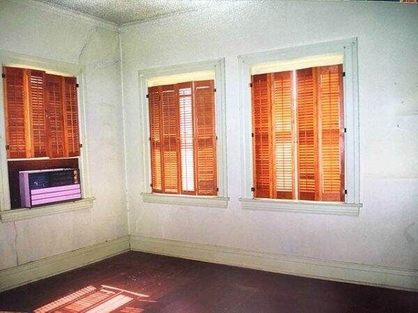
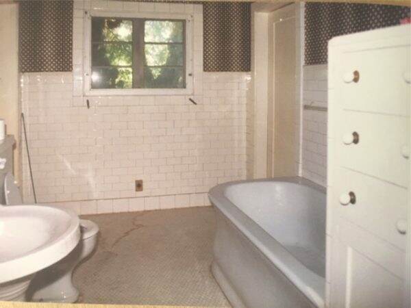
The original master bath looked like this~~love the dizzying wallpaper. The unique cast iron tub was moved to our daughter’s bathroom. We completely refigured and enlarged the space.

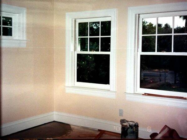
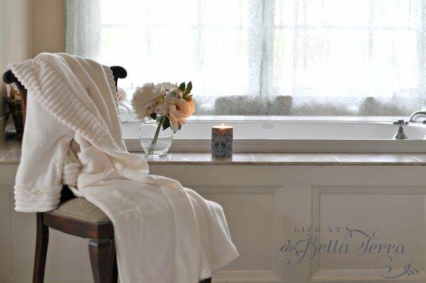
Here is the same perspective today. We replaced the window with two larger casement ones and added a Kohler soaking tub. We designed the tub enclosure so one of the raised panels in front can be removed if the plumbing needs attention.

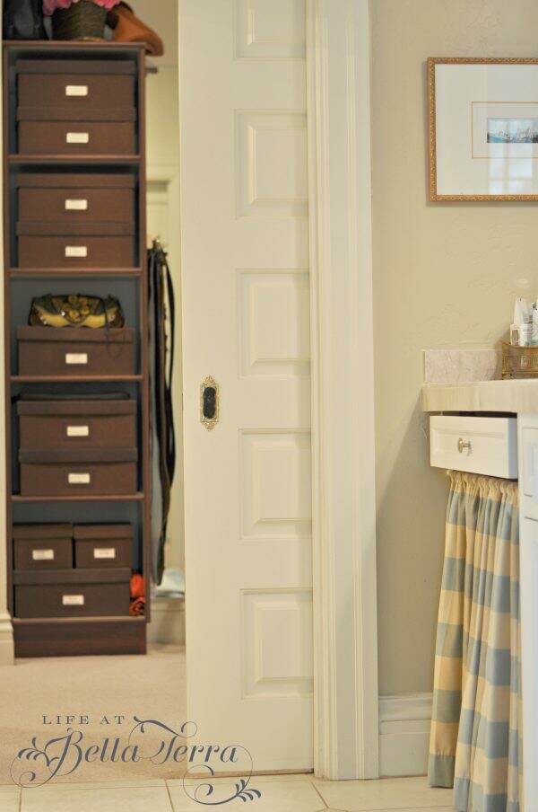
There are two doors leading from the master bedroom into the bath/closet area. Perfect for privacy when the bathroom is needed for early morning use.

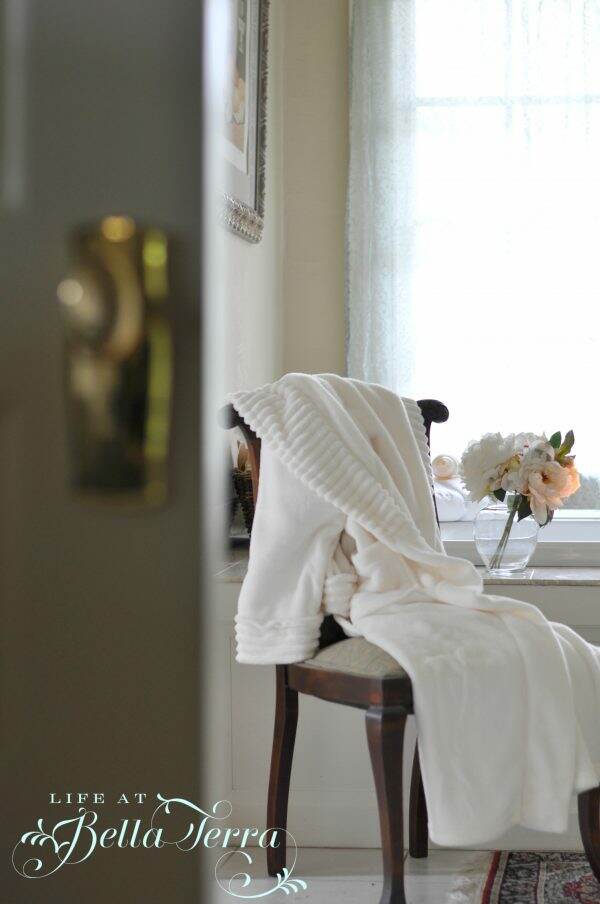
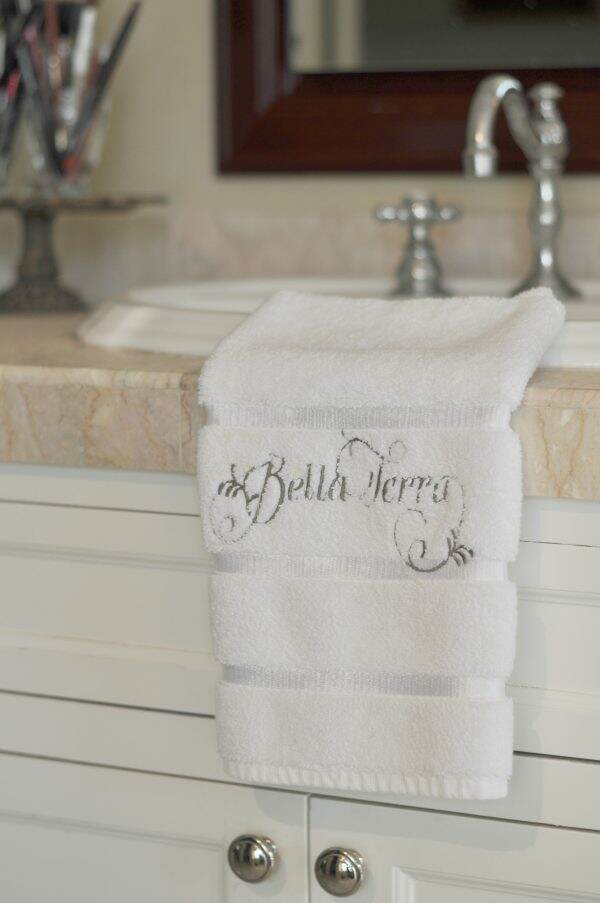
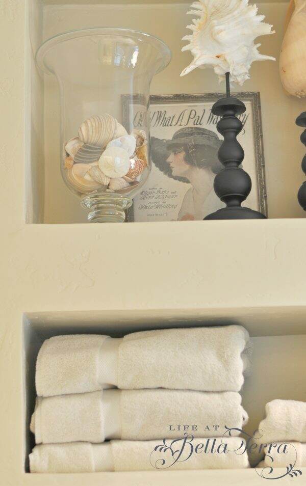
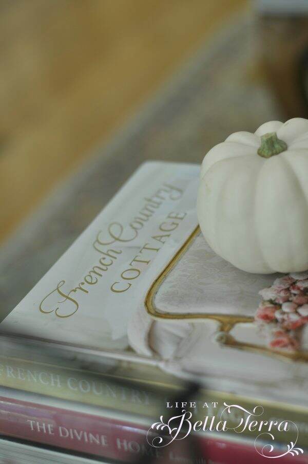
My sister, who is a master at sewing, made me a set of Bella Terra towels~~such a wonderful gift! The candle was another gift (lucky me!) from my friend, Lisa.

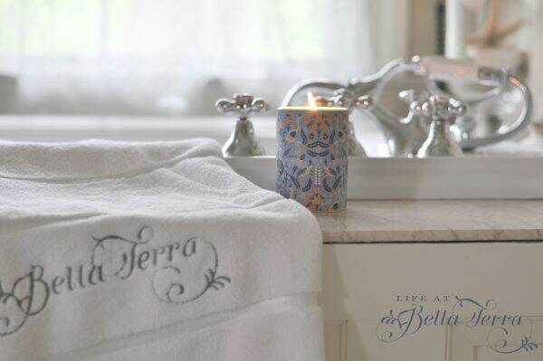
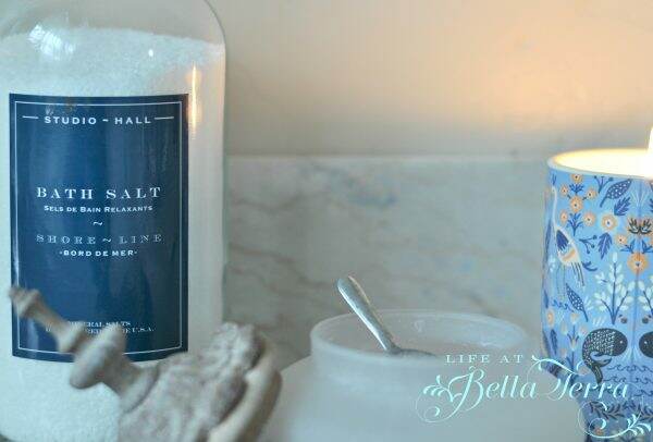
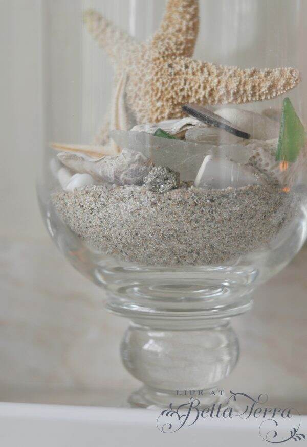
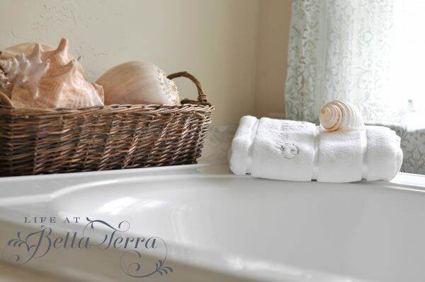
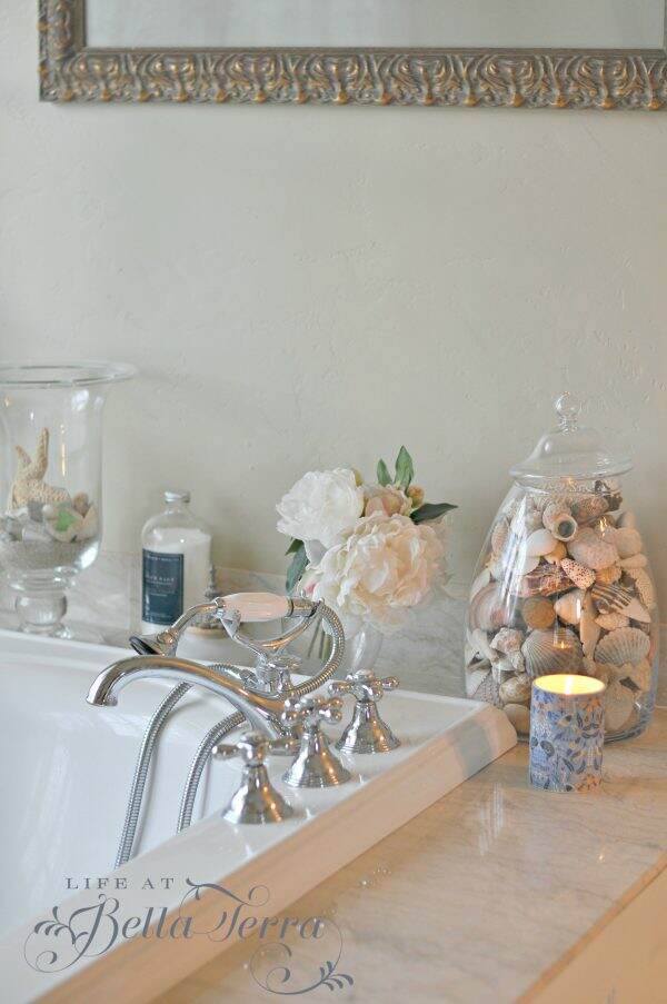
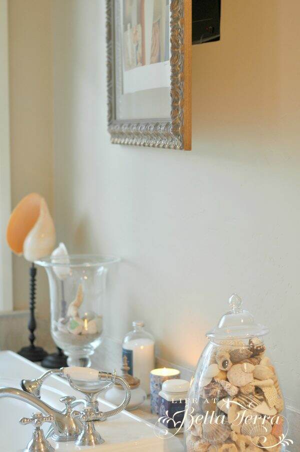
The tub has a wide marble shelf on all sides that is perfect for displaying my shell collection and providing easy access to candles, bath salts and towels. The large glass jars/containers are made by Simon Pearce.

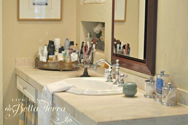
My husband and I have separate sinks (yay!). The framed mirror is a medicine cabinet from Robern.

My cabinet was designed to have a make up table, but I never use it.  Instead, I covered the opening where a seat would have been, with a curtain.  This has become a great place for storing toilet paper and other supplies.  The curtain is changed out with the seasons, as are the towels and bath mats.

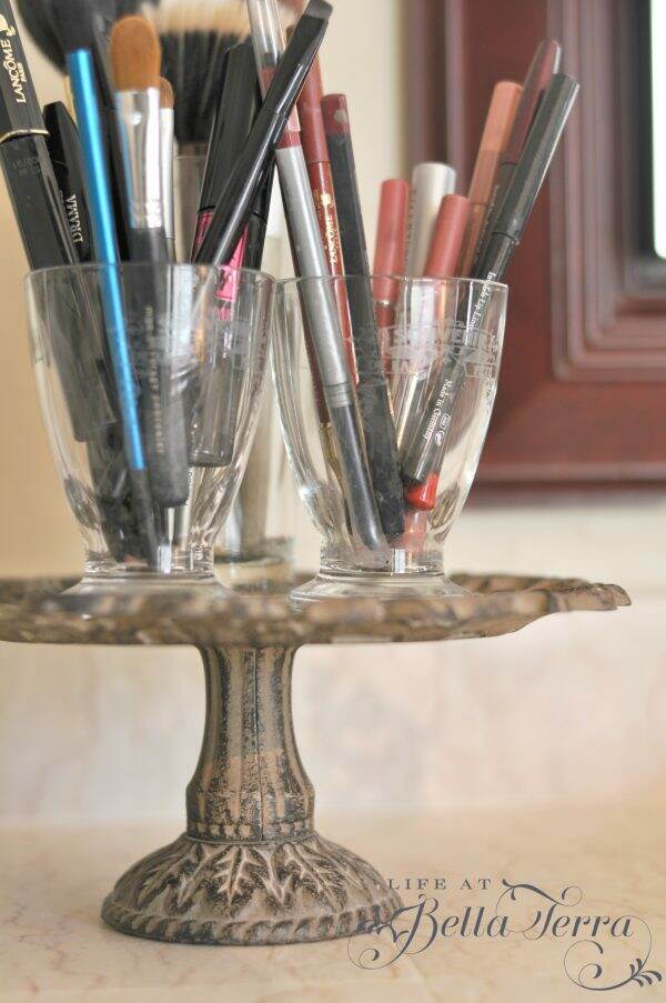
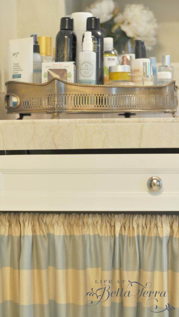
Everyday make up supplies are kept in French glasses on a small cake pedestal.  The older I get the less makeup I wear, so having a few things handy is very convenient.  Raised and off the counter, keeps things looking neat. A large brass tray holds everything from hairspray to mouthwash.

Sorry for the shift in light, but the natural light changed during these photos.  Begrudgingly I had to use overhead lights for some of these shots. 🙁

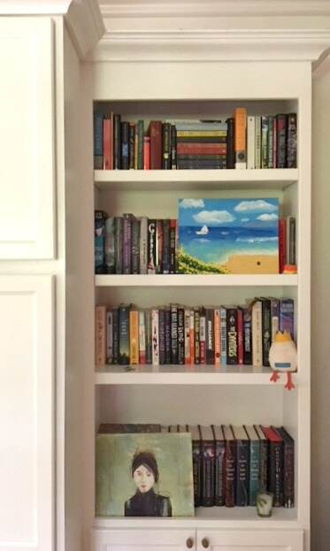
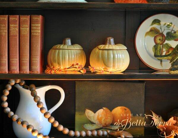
Cubbies were built into the wall for towels, bottles of water and more of my shells! The framed sheet music, “Oh! What A Pal Was Mary” was a gift from my dear friend, Gwen.

The walk-in closet is tucked beyond the pocket door.  A separate room houses the toilet and bidet.

Near the tub, behind the art, is a hidden television. I used acrylic vs. glass in the picture frame (for a lighter weight and to prevent any glass hazard). With a piano hinge on one side, the frame easily opens to expose a small  t.v. on an articulating arm.

Most older homes have small bathrooms and limited closet space. By reimagining this space, we were able to create an indulgent spot just for us. The tub is a perfect place for my weary bones after hours of gardening.  Separate sinks, a large shower with 2 shower heads and a private water closet provides all the niceties one needs when beginning or ending the day.


Large glass jars/container made in the USA:  Simon Pearce

Soaking bathtub, sinks, toilet, bidet and faucets by Kohler

Cabinets were custom made

Paint color (walls):  Cochise by Dunn Edwards SP2560 in eggshell

Paint color (trim): Dunn Edwards Cottage White SP 113 in semi-gloss

Medicine cabinets by Robern

Windows by Marvin

Window sheer by Pottery Barn


Fall Decor Touches in the Living Room

It is that time of year when the temperatures are shifting ever so slightly lower, that I am inspired to add a few fall decor touches to the living room. I recently went to Trader Joe’s to buy pumpkins for my living room mantle and they had NONE. They had not shipped yet from the warehouse and no pumpkins were to be had in Phoenix.

As a result, I will show you the living room fall decorations sans fireplace mantle. Hopefully that will happen in the next week or so. The challenges of living in the hot southwest!

The living room colors are mostly linen white and French blues accents, with a richly color Oriental rug. Orange is a complement to blue so I sprinkled in some, along with white and neutrals.

Thankfully I have a rather large selection of fabric pumpkins, and placed a few on the sofa table.

The horse sitting on the table behind the sofa did need something for this time of year, so a sprig of artificial berries did the trick.

My pumpkin painting has the appropriate colors for this room.  Completed a few years ago, it was one of my first autumn paintings.

The coffee table’s English terrarium received a fall theme~~adding books, fabric pumpkins and some berries.

A blogger I follow, Courtney Allison from French Country Cottage, just released her first book. It is truly spectacular! I am getting ready to attend a book signing by Courtney~~cannot wait to meet her in person!

Perhaps the oldest piece of furniture I own, is a Hepplewhite Secretary, dating from 1790-1800. The glass doors are designed with 13 panels for the original 13 colonies. The lower portion opens up into a desk with beautiful inlaid wood cubbies. I purchased this many moons ago when I could barely afford anything. But I knew this was a special piece and have cherished it for decades.

The shelves are glass and edged in wood. There is a strip of lighting both on the inside top and bottom of the shelves. If you look closely you can see the electrical wire on the right hand side. The light illuminates through the shelves and creates a warm, magical glow.

A few pieces of my English autumn china grace the top shelf.  Windsor Ware Harvest Fruit by Johnson Brothers has the fruit center and Tonquin by Royal Staffordshire is the other. I would love to keep adding to this collection so if you see any in your travels, keep me in mind!

Here is the view with the lights on.

The soup tureen is Indus RSR, an English brown transferware pattern from the 1870s.  It’s missing the ladle but I love the pheasant pattern.

The pumpkin soup tureens and apple plates are from Williams Sonoma.

The wooden beads with a heart I purchased from Painted Fox.  I have no recollection where I got the birds, white pitcher or brass box.  The painting was a gift from my friend and art teacher, JoAnn Augur. To see another post about my art classes, click here.

With a hint of cooler temperatures in the morning, I am getting more inspired to add fall touches to the rest of the house.  Can’t wait to share them with you! To see some fall decor from last year, click here.


DIY~Stenciling a Wood Floor

This image has an empty alt attribute; its file name is stencil7-600x800.jpg

We are fortunate to head to the mountains for the holiday weekend. Typically that means rest and relaxation, but instead I am tackling a DIY project~stenciling a wood floor.

The weather this particular afternoon was chilly and hailing…very conducive to working indoors. To see more of our mountain cabin, click here.

The space needing improvement is a landing on the interior steps to the second floor. Where the stairs make a 90 degree angle, the landing is covered in an oak/pine veneer? The overall look is rather cheap, compared to the adjacent chunky, floating steps.

Determine the Stencil Design

In keeping with the old adage, if you can’t hide it, make it a focal point. In attempts to cover this area, I decide to stencil the wood floor. The “Forest Floor Damask” stencil from Royal Design Stencils is $49.95 online.  The stencil is 22″ x 22″ which will require about 4 full repetitions and 4 partial stencils to fill the space. I also did not pre-treat the floor~~just wiped it clean with water.

Select Your Paint Colors

Honestly, the hardest part for me was determining what color paints to use.  I considered using just one color, but decided to take on the challenge of multiple colors.

Since the theme is Forest Floor and the cabin IS in the mountains, I select shades of nature in browns and greens. I am using small sample paints from a local hardware store.

Measure and Secure

Since this stencil is a random pattern, I place the first stencil in one corner of the landing. If the stencil design has a border or a block design, I would measure and place the stencil in the visual center.

Starting with  two main colors, I add white paint to each color to obtain various hues. Using plastic disposable cups is perfect for mixing paint. I secure the stencil to the floor with blue painters tape.

Apply by Dabbing

In order to keep the paint from bleeding under the stencil, I tap the excess paint off the bottom of the brush.  The paint is applied by dabbing, not stroking the paint on the stencil. Note: Make sure you use good stencil brushes. Mine are from Royal Stencil Designs. There are sold out, however, you can purchase other stencil brushes online here.

I paint the “branches” in a shag bark color. See below for the Sherwin Williams colors used.

Sorry for the shift in light in the photos but we added industrial lamps so I could better see my work space.

Next, I paint the larger leaves in a pine green. Doing the very first stencil is a bit intimidating as I wasn’t completely sure what color would go where. But it is typical to feel this way but go with your instincts.

The orange flower color is a combination of yellow, sienna, raw Sienna, alizarin red, gold and copper acrylic paints (from my art supplies). Make sure you mix enough paint to complete all the flowers (or make good notes on the color of paint and quantity you are using).

The stencil has guide marks in the border to help align the design.

Four complete stencils cover most of the landing.  Look at the very unattractive edge at the top of the photo.  I will cover that later with a solid 1.5” painted border.

Stenciling the Edges

It is a bit difficult to bend the stencil to get the partial stencils painted on the edges but securing it with the blue tape helped.

Add a Border

Lastly I add a solid border on all four sides. Please make sure your stencil paints are completely dry.  You can then tape the border size you want with blue painters tape.  I also use the blue tape on the walls to protect them from any splashing paint.

Here is a photo I took the next morning.  Again, it’s hard to capture the actual colors due to the indirect light.  The brown tones look blue here.

Apply Protective Layer

I will add a matte finish protective coating over the top during our next trip to the cabin.

All in all, I was pleased with the end result.  If you have a floor or wall that you aren’t happy with, you may want to consider stenciling it. Now, instead of an eyesore, I have a piece of original art!

Have you ever stenciled a floor? To see my prior floor stenciling project on a concrete floor, click here. And I recently completed a DIY project stenciling a bathroom tile floor, which can be seen here. Stenciling is an affordable way to upgrade a floor, wall or backsplash.

Thank you for visiting Life at Bella Terra.  If you love old historic homes, please sign up and follow my blog.   As a fan of Before and Afters shots, I try to include many of them in the houses I restore. You can also find me on Instagram @lifeatbellaterra and Facebook.  I so appreciate you following me and look forward to  your comments and feedback.

Have a wonderful week!

If you enjoyed this post, please feel free to share with others on Pinterest.

Stencil:  Royal Design Stencil Forest Floor Damask

Paint:  Sherwin Williams Latex Acrylic, SW 3001 Shagbark and SW3037 Shade Tree.


E-commerce subscriptions and Gift ideas

I am not the most current on trends, but I find the concept of e-commerce subscriptions fascinating. My first encounter was Stitch Fix, nearly five years ago.  Stitch Fix, is a company that mails you a monthly box of clothing and accessories.

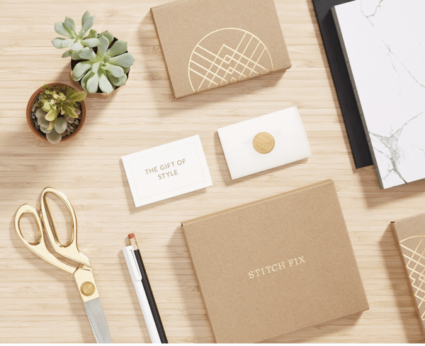
The items are hand-picked by Stitch Fix’s 3,500 full- and part-time stylists, who work with the company’s team of more than 80 data scientists to suit customers’ tastes. Stitch Fix charges a $20 fee for each box (which goes toward any purchases the customer makes). Clients pay extra for the clothing they keep, and can return what they don’t want.

My daughters and I subscribed after filling out a lengthy style questionnaire.  It was fun to see what a design consultant who had never met you or knew what you looked like, would select and send.

Since the company was relatively new, some of the styles weren’t to my liking so I cancelled. The company has since evolved and expanded, including a line for men and children. I may give them a try again, as I am not fond of clothes shopping.

Katrina Lake, 34, is the founder and chief executive of Stitch Fix. The company brought in $730 million in revenue in its 2016 fiscal year. Katrina was 26 years old when she founded Stitch Fix in 2011….very impressive.

I have used Stitch Fix for gift giving and it is easy to do so. You can print, email, or send a gift card in whatever dollar amount you want.

~~~~~~~~~~~~~~~~~~~~~~~~~~~~~~~~~~~~~~~~~~~~~~~~~~~~~~~~~~~~~

One of my favorite bloggers is Sharon Santoni from My French Country Home.  She has created a quarterly Subscription Box that I recently used as a birthday gift for my sister in Connecticut.  The theme for the August box was French kitchen and not only was the box beautifully wrapped, the items inside were spectacular. And it was mailed from France! My sister was delighted with the high quality of items and presentation.

Here are the contents of the August Stylish French Box with further details on a few of the items.

Box N 7 August 2018- MY STYLISH FRENCH BOX

Artist Celine Chollet features a blue-shuttered house in Provence.

Watercolor- Box N 7 August 2018- MY STYLISH FRENCH BOX

Marseille soaps by Marius Fabre: These soaps from Marius Fabre come from a family-owned business in Salon de Provence that still makes their products in the same way as their great-grandfather did a century ago.

Marius Fabre- Box N 7 August 2018- MY STYLISH FRENCH BOX

A stoneware pottery bowl by the Manufacture de Digoin: Fabricated in the Ceramic Valley, deep in the Burgundy region, this bowl will impress you both with its durability and the craftsmanship that went into its creation.

Manufacture de Digoin- Box N 7 August 2018- MY STYLISH FRENCH BOX

Three copper cannelé molds: These adorable copper molds are used to bake cannelés, a traditional Bordelais pastry.  Or insert tea candles for a French-inspired deco piece.

Cannelé molds- Box N 7 August 2018- MY STYLISH FRENCH BOX

An antique teacloth: This brocante item is one that you’ll find as functional as it is pretty. The red-on-white pattern is traditional of this type of linen blend teacloth.

Antique teacloth- Box N 7 August 2018- MY STYLISH FRENCH BOX

A book of recipes: All come straight from Sharon’s kitchen, made with wholesome, seasonal ingredients.

Recipe book- Box N 7 August 2018- MY STYLISH FRENCH BOX

There was also a beautiful copper candle, an apron and chocolate fondant included in the box. For more information on My Stylish French Box, click here.

~~~~~~~~~~~~~~~~~~~~~~~~~~~~~~~~~~~~~~~~~~~~~~~~~~~~~~~~~~

It’s been hard finding good flowers here in Phoenix during the latter part of summer.  Nothing exciting is growing in the yard, and our local retailers have meager pickings. Motivated by my desire for a different selection of fresh flowers, I signed up for a monthly delivery from The Bouqs.

Their farm-to-table flowers come from eco-friendly, sustainable farms around the world.  You can cancel anytime so I thought it was worth a try.

I set it up so I get Farmer’s Market flowers on the 12th of each month. They are (were?) having a 20% off and free shipping sale which pushes me over the edge to order.

The Bouqs also has a gift option online so it is very easy to send a bouquet to someone you love.  I will let you know the quality and quality of my flowers when my first subscription arrives on September 12th.

There are many e-commerce boxes available–from beauty to art to supplies.  On a recent post (click here to read) I shared my subscription to Paris Letters, which has been a delightful experience for someone like me that appreciates getting a fabulous letter in the mail.

If you are getting a subscription box, please let me know what it is and if you love it.  With the holidays approaching, having e-commerce at our finger tips expands our gift giving options.

Excerpts and photos taken directly from My French Country Home, Stitch Fix and The Bouqs.


My Daughter’s Bedroom

When we first remodeled Bella Terra, the original intention of this room was to be a computer/TV/hang out room for our then 2 children.  But God works in strange ways and I became pregnant with our 3rd child in the middle of our 3 year renovation.  Of course the doctor had told me that it was highly unlikely I would get pregnant (my “advanced” age) coupled with my last pregnancy ending in a miscarriage.  Surprise!

This room had several problems~~large plaster cracks and a floor that significantly sloped to one side. The wood flooring was mismatched and in poor condition.  When we pulled up the floor boards, the joists were random heights, contributing to the non-level mess. Structurally, the corner of the house had settled. It was painted mental institution green.

Since every single window had to be replaced in the house, we took this opportunity to change the larger northern window to a smaller, fixed one. The original window led out to the top of the porte cochere and I envisioned late night escapes done by mischievous children.

Here is the renovated room prior to flooring.  It was painted a soft peach to match the Ralph Lauren florals I had chosen for her crib and bed~~perfect room for my new little girl.

When Elisabeth became a teenager, naturally she wanted a room change.  I still remember the day when she asked, “Mom, can I paint my room orange and blue?” Hmmm.  I asked what shade of orange.  She promptly showed me International Orange~~yes, that super bright, come save me in the middle of the ocean emergency color.  Groan.  But I have a fond memory of MY mother letting me paint my room a ridiculous shade of purple when I was that age. I smiled and said, “Sure!”

We agreed to painting two of the four walls orange, but two would need to be white~~for balance and a visual break in color.

We painted the room ourselves~a mother/daughter project and she was so proud when it was finished.  I admit I was hesitant at first, but the color is SO cheerful and happy.  There is quite a bit of painted white trim (baseboards, door/windows) which is crisp and clean against the orange.

Here’s the view when you step into her room.  The bed has assumed a few different positions, but this is her current layout (which gives her more friend space). The rolling cart acts as a night stand and is from IKEA.

When she graduated to a full size bed, I purchased the fabric headboard from Joss and Main.

There is always an abundance of stuffed animals on the bed. 🙂

The original room did have a closet, but during the renovation (pre-new baby), I reconfigured it to be used in the adjacent room. So we needed to add closet space.  We created these built-ins from the kitchen design department at Home Depot.  The white finish adds balance to the orange.


All my children LOVE to read and collect books so a bookcase was added to the side of the closet.


Across the room is her desk/work station. She has a cork board area and spaces designated for supplies.

A large world map mounted on a metal board provides magnetic ways for her to display trinkets and memorabilia.

As a Christmas present I painted a picture of Sox, her beloved dog.  Though not planned, I’m glad the blue works with her color theme.

I hope you enjoyed this brightly colored room! It reinforces the notion to take risks with paint color!


Paint Colors: Sherwin-Williams Manual Knockout Orange

Dunn Edwards 354 Van de Cane (white)

Large Pillow fabric:  Joann’s

Striped comforter fabric:  IKEA

Rug:  IKEA

Pencil containers:  IKEA

Pears and Women in black top paintings:  Artist – me

Beach painting:  Artist: my daughter

Lamp: IKEA

Custom Windows:  Marvin Windows


Paris Letters

I find it intriguing the way some people creatively make a living.  Imagine having an unfulfilling job only to leave it (after careful planning) and going to Paris? That is exactly what Janice MacLeod did and as a result, she wrote her first book and memoir, Paris Letters.

This is a book you continue to ponder long after the last page is read. Without giving too much of the story away, the author decides to change the course of her life.  In doing so, many unexpected gifts occur along the way.

Her journey leads the author to establishing her own business~~creating and writing “Paris Letters”~~yes, the snail mail kind.  You can sign up to receive your very own Paris letter from the author~~either just one letter or a 6 to 12 month subscription.

In the day and age of social media and the internet, it is such a gift to receive a letter in the mail. Excitedly, I signed up to receive a year of Janice MacLeod’s monthly Paris letters.  This can be done through Paris Letters Press on Etsy here.

If I didn’t read this book, I would have never known that a monthly subscription like this even existed!

I must admit I was waiting for the mail to come every day since I signed up…..and my painted letter arrived yesterday!

The envelope felt very Parisian, with lovely stamps.

Of course, how can one read a letter from Paris without having some French wine? It’s been so hot in Phoenix that only a very chilled bottle of rosé will do. Not the sweet one, but the dry version from Provence.

Isn’t this just beautiful?

Janice does the illustration in watercolor that accompanies the letter.

Wouldn’t this be a lovely gift for a relative or friend? If you know of someone who would appreciate getting a beautifully illustrated letter in the mail, this is perfect!

Since I enjoyed her first book so much, I just completed her second book, A Paris Year.

Unfortunately I read it on my Kindle while on vacation, therefore didn’t get to appreciate all the color pictures and illustrations in the book. If I were ever to go to Paris, I would bring this book as my guide.  Janice goes through each day of the year detailing the sights, activities, and the nuances of Paris.

I received 3 things from this experience.  1) Found great books to read and lessons to contemplate; 2) Discovered Paris Letters and subscribed; 3) In my own way, I am helping a small, creative, business owner.

Happy Tuesday!